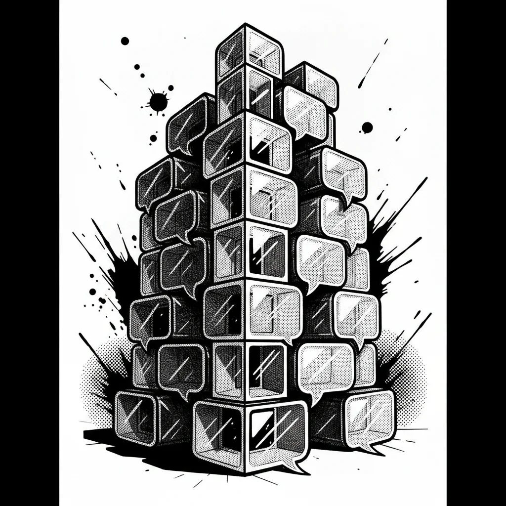

The Fundamentals of an Effective Bubble
The Importance of Readability
A speech bubble is not just a simple container for text. Its shape, size, and placement directly influence how the reader perceives the information and the character's emotion. Poorly designed bubbles can distract, or even hinder, the understanding of the action or thoughts.
Size and Proportion: Finding the Right Balance
The size of the bubble should be proportional to the amount of text it contains, while respecting the panel's space. Bubbles that are too large can overwhelm the illustration, while bubbles that are too small make the text difficult to read. It is essential to leave sufficient space between the text and the edge of the bubble for optimal clarity.
Strategic Placement: Guiding the Reader's Eye
The placement of bubbles within the panel is as important as their size. They should be positioned so as not to obscure key visual elements of the drawing and to naturally guide the reader's eye through the sequence. Good panel composition integrates bubbles as a graphic element in their own right.
Bubble Shapes and Their Meaning
Each bubble shape communicates an intention: the classic bubble for dialogue, the jagged bubble for a shout, the cloud-shaped bubble for thought, the bubble with points for a scream or anger. Using the correct shape enhances the impact of the speech and the character's expression.
Simplify Your Bubbles
Discover how Bulle.ai can help you manage the size, shape, and placement of your speech bubbles for optimal clarity.
Try Bulle.aiStabilize Your Bubbles Without Overloading Your Pages
The Bubble as a Graphic Element
It is essential to consider the bubble not as an afterthought, but as an integral part of the panel's composition. A well-thought-out bubble harmonizes with the lines and shapes of the drawing, contributing to the overall aesthetic rather than detracting from it.
Visual Consistency of Bubbles
For a manga series, maintaining consistency in the style and size of bubbles is paramount. This helps the reader immerse themselves in the universe without being distracted by unexpected stylistic variations. This applies to dialogue bubbles as well as thought bubbles or onomatopoeia.
Negative Space for Clarity
Do not be afraid to leave empty space around and within bubbles. Negative space is a powerful tool for improving readability and highlighting essential content. A panel overloaded with bubbles and text loses its impact and tires the reader.
Integration with Backgrounds and Characters
The way bubbles interact with backgrounds and characters is crucial. They should not conflict with important graphic elements or hinder the reading of facial expressions. Sometimes, it is better to reduce the text or move it to preserve the integrity of the image.
The Impact of Transparent Bubbles
The use of transparent bubbles, where the background is visible through them, can be an effective technique for maintaining visual immersion. However, this requires careful attention to text readability, which must remain perfectly clear despite the transparency.
Guaranteed Graphic Consistency
Maintain a strong visual identity for your series with tools that aid in creating speech bubbles.
Optimize My WorkflowOptimize Your Workflow with Modern Tools
For effective management of your speech bubbles and improvement of your creation process, consider the following criteria. These elements, once mastered, will allow you to gain in productivity and quality.
| Criterion | Detail |
| Text readability | Ensure that the chosen font is clear and legible, even at small sizes. The spacing between letters and lines (leading) should be sufficient to avoid visual fatigue, especially for long dialogues. |
| Typographic consistency | Define a typographic charter for your speech bubbles (font, size, weight) and stick to it. This ensures a stable visual identity for your series, reinforcing professionalism. |
| Space management | Use internal margins in your speech bubbles so that the text does not stick to the edges. The space between the text and the tail of the bubble should be constant and sufficient to avoid giving a feeling of confinement. |
| Visual hierarchy | The size and position of speech bubbles can help establish a hierarchy. Important dialogues can be slightly larger or placed in focal areas of the panel. |
| Integration with the drawing | Speech bubbles should integrate harmoniously with the drawing. Avoid placing speech bubbles where they would cover essential elements of the face or action. Sometimes, a slight adjustment to the panel's layout can solve the problem. |
From Idea to Page
Transform your concepts into professional manga pages by streamlining the dialogue creation process.
Discover the ToolsConclusion
Mastering speech bubbles is a fundamental skill for any manga illustrator aiming to create clear and impactful works. By applying these principles of readability, proportion, and strategic placement, you will significantly improve the reading experience. Remember that tools like Bulle.ai are designed to help you streamline this process, allowing you to focus on what matters most: your art and your story. Explore these solutions to turn your passion into professional pages and create manga with greater ease.