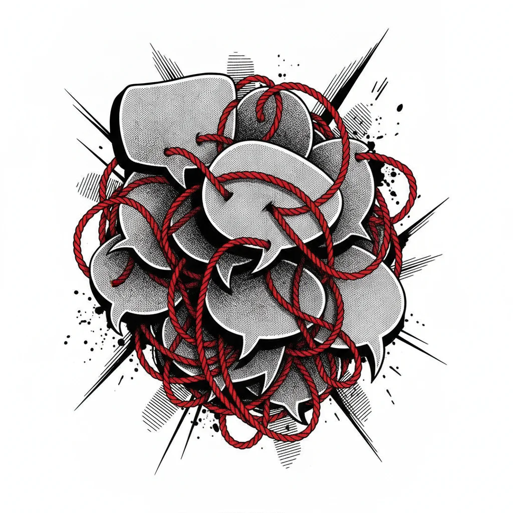

Bubbles That Devour the Image: Three Pitfalls to Avoid
The Invader: The Too-Large Bubble
An excessively large bubble can quickly become the focal point of the panel, overshadowing the drawing and action. This creates a break in the visual rhythm and can give an impression of haste or lack of care in the layout.
The Ghost Bubble: The Detrimental Empty Space
Conversely, bubbles that are too small or too far apart can leave empty areas that detract from narrative density. The reader may feel that the information is diluted, lacking the expected impact.
The Domino Effect: Destructive Overlap
When bubbles overlap chaotically, they create visual confusion. The reader struggles to follow the thread of the dialogue, which can lead to a loss of interest and misunderstanding of the scene.
Improve Your Bubbles
Learn to master the placement of your bubbles for maximum visual impact.
Discover the ToolsUnderstanding Bubble Placement Pitfalls
- Intrusive bubble
- A bubble whose size exceeds that of important graphic elements or the breathing space of the panel. It draws the eye at the expense of the characters' action or expression.
- Dead spaces
- Areas of the panel left empty by bubbles that are too small or poorly distributed, creating a sense of dispersion and weakening the reader's focus on the content.
- Chaotic overlap
- Several bubbles overlapping illogically, making it difficult to identify who is speaking and in what order. This disrupts the reading flow and can generate frustration.
- Out-of-frame bubble
- A bubble, part of which extends beyond the panel, creating a visual break and suggesting incomplete information or poor integration into the panel layout.
- Misoriented bubble tail
- The tip of the bubble (which indicates the speaker) pointing towards a background element or in an irrelevant direction, misleading the reader about the origin of the dialogue.
Strategies for Optimal Bubble Placement
Mastering the art of bubble placement is essential for ensuring smooth reading and maximum impact. Here are concrete strategies to avoid common mistakes and enhance your visual storytelling.
| Criterion | Detail and Action |
| Bubble Size | Adapt the size to the text. Leave a minimum of space around the words for readability, but avoid wasted space that would distort the panel's composition. |
| Placement | Prioritize natural reading areas (often left to right, top to bottom). Place bubbles so they do not obscure faces or key actions. Use negative space wisely. |
| Dialogue Order | For multiple speakers in the same panel, follow a logical order (e.g., left to right, or top to bottom). Ensure the bubble tail clearly points to the speaking character. |
| Visual Consistency | Maintain consistency in bubble style and placement throughout pages and chapters to reinforce your work's identity and the reader's familiarity. |
| Text Readability | Choose a clear font and an appropriate size. Ensure sufficient contrast between the text and the bubble background. |
| Integration with Art | Ensure the bubble's shape and placement complement the artwork, even interacting with it, without ever distorting or hindering it. |
Conclusion
Bubble placement is a subtle art that requires attention and practice. By avoiding these three fundamental mistakes – bubbles that are too large, too spaced out, or poorly overlapped – and by applying optimal positioning strategies, you will significantly improve the readability and visual impact of your manga. To go further and explore innovative solutions for managing your bubbles and your series project, discover the tools designed for creators and facilitate the creation of your manga.